
Css Grid Career Quick Facts (Global 2026)
Indicative Salary Ranges:
While compensation varies heavily by region and employer, these are typical illustrative ranges for Css Grid roles.
| Role Level | Example Remote Range (USD/yr) |
|---|---|
| Junior / Associate | $40,000 – $75,000 |
| Mid-Level | $70,000 – $110,000 |
| Senior / Lead | $120,000+ |
Table of Contents
1. What Is CSS Grid? 2. Why CSS Grid Was Created 3. Why Every Front-End Developer Should Learn CSS Grid 4. Understanding the Grid Concept 5. How CSS Grid Works 6. Real-World Examples of CSS Grid 7. CSS Grid vs Older Layout Methods 8. Important CSS Grid Terminology 9. Industries That Use CSS Grid 10. Common Beginner Mistakes 11. Creating Your First Grid Layout 12. Understanding Grid Columns 13. Understanding Grid Rows 14. The Power of Fractional Units (fr) 15. Using Repeat() 16. Creating Flexible Layouts with minmax() 17. Auto-Fit and Auto-Fill 18. Positioning Grid Items 19. Aligning Content 20. Responsive Design with CSS Grid 21. Combining CSS Grid with Flexbox 22. Practical Layouts You Can Build 23. Performance Benefits of CSS Grid 24. Browser Compatibility 25. Best Practices for Using CSS Grid 26. Common Mistakes to Avoid 27. Career Opportunities After Learning CSS Grid 28. How to Practice CSS Grid EffectivelyRemember the days when creating a beautiful, responsive website felt like wrestling with code? A few years ago, we were stuck using HTML tables for page layouts. Then came CSS floats, and eventually Flexbox, which was a huge relief for one-directional styling. While these techniques were massive lifesavers back then, they still left us scratching our heads when it came to truly complex, multi-dimensional page layouts.
And then CSS Grid came along and honestly, it changed absolutely everything.
CSS Grid is undoubtedly one of the most powerful and intuitive layout systems we've ever seen in CSS. It gives developers like you the power to craft stunning, responsive, and beautifully organized web layouts with a fraction of the code we used to need. Gone are the days of hacking together complicated positioning tricks; now, you can design clean, perfectly flexible layouts using simple rows and columns.
Whether you're piecing together a sleek personal portfolio, launching a bustling online store, or designing an intricate admin dashboard, CSS Grid hands you total, effortless control over exactly where and how your content sits on the screen.
If you're new to this, don't worry we've got you covered! In this beginner-friendly guide, we'll walk through exactly what CSS Grid is, why it's such a game-changer, how it all works, and why mastering it will make your life as a developer so much easier.
What Is CSS Grid?
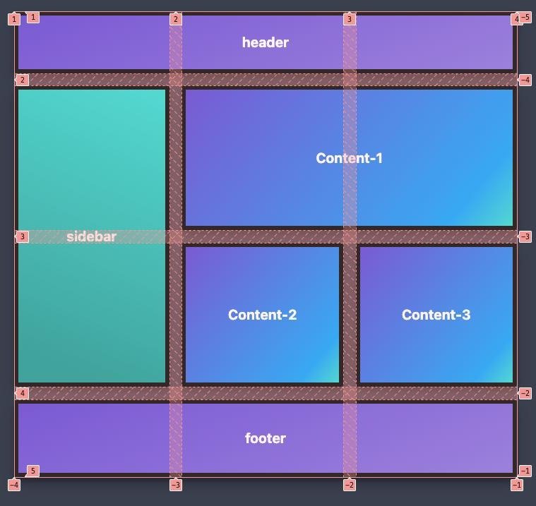
At its heart, CSS Grid is a brilliant two-dimensional layout system built directly into CSS. It gives you the power to organize your web page elements into clear, easy-to-manage rows and columns.
Unlike older layout methods that only let you move things in one direction (either across or down), CSS Grid lets you handle both horizontal and vertical positioning at the exact same time. It's like having a superpower for building complete, cohesive page layouts.
Picture a piece of graph paper where every little square fits perfectly into a larger grid. CSS Grid works a lot like that! You just divide your webpage into invisible rows and columns, and then you get to drop your content exactly where it looks best.
No more relying on weird CSS hacks or painful calculations Grid gives you a totally straightforward and dependable way to bring your layout designs to life.
Why CSS Grid Was Created
Let's be real before CSS Grid, creating responsive layouts could be incredibly frustrating.
We all ran into the same painful headaches:
- Uneven spacing between elements
- Difficult alignment
- Complicated nested structures
- Layouts breaking on different screen sizes
- Excessive CSS code
As our web designs naturally became more ambitious and sophisticated, these limitations just became too annoying to ignore.
That's exactly why CSS Grid was created. It stepped in to solve these daily struggles by giving us a dedicated layout system that is genuinely flexible, wonderfully readable, and deeply responsive.
The best part? Today, it's fully supported by all major modern browsers, meaning you can confidently use it right now for your real-world projects.
Why Every Front-End Developer Should Learn CSS Grid
Learning CSS Grid is about so much more than just putting boxes on a screen; it brings some amazing perks to your workflow.
Cleaner Code
Grid helps you build impressively complex layouts with significantly fewer lines of CSS. This means your code stays delightfully clean, making your projects a breeze to maintain and share with your team.
Responsive by Design
We all know modern websites need to look flawless on everything from giant desktop monitors to tiny smartphones. CSS Grid comes packed with smart features that let your layouts adapt gracefully to any screen size no need to juggle multiple versions of your page.
Better Organisation
Rather than nudging elements around manually, Grid lets you define your entire structure up front. This organized, big-picture approach speeds up your development and saves you from frustrating layout bugs.
Professional Layouts
Take a look at any gorgeous modern dashboard, blog, or online store, and chances are they are powered by CSS Grid. It simply offers a level of flexibility that traditional techniques can't match.
Improved Maintainability
As your projects grow in size and complexity, having organized CSS is an absolute lifesaver. Grid makes it delightfully simple to tweak or completely overhaul your layouts without having to rewrite chunks of your code.
Understanding the Grid Concept
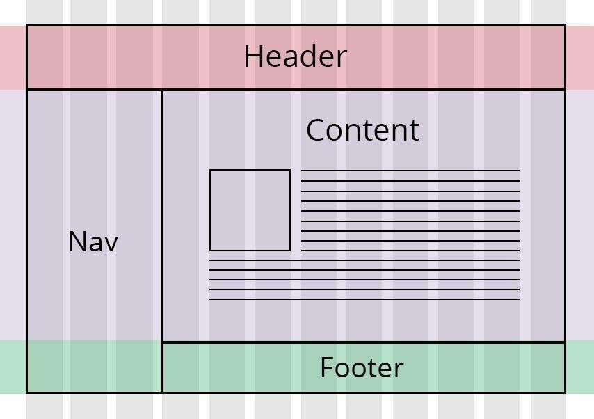
Don't worry, the concept is quite simple. Every CSS Grid layout revolves around two main friends:
Grid Container
The grid container is essentially the parent element it's the home base where Grid is first activated.
As soon as you enable Grid on this container, all of its direct child elements instantly wake up and become "grid items".
You can think of the container as the invisible scaffolding that dictates exactly how your page is organized.
Grid Items
Grid items are simply the individual pieces of content that live snugly inside your grid container.
These are things you work with every day, like:
- Navigation bar
- Sidebar
- Hero section
- Articles
- Images
- Cards
- Footer
The beauty of it? Each of these items can be moved around and positioned independently, all while happily obeying the overarching structure you created.
Rows and Columns
Rows are the tracks that run horizontally across your page.
Columns are the tracks that run vertically from top to bottom.
When you put them together, they form a wonderfully flexible skeleton that lets you place content exactly where it feels right.
For instance, let's say you're building a blog homepage. It might feature:
- Header at the top
- Navigation below the header
- Main article section
- Sidebar
- Footer
With CSS Grid, you can easily tell each of these sections to comfortably sit in their own specific rows and columns, ensuring nothing overlaps unless you actually want it to.
How CSS Grid Works
The workflow is so intuitive, you'll pick it up in no time:
First, create your container.
Second, enable Grid.
Third, tell it how many columns you need.
Fourth, define your rows (if you need them).
And finally, just drop your content right into the grid.
Once you've set up those simple rules, the browser takes over and automatically arranges everything beautifully.
This completely takes away the headache of the tedious, manual positioning we used to endure with older layout tricks.
Real-World Examples of CSS Grid
You might not realize it, but CSS Grid is quietly powering many of the beautiful layouts you interact with every single day.
E-Commerce Websites
Have you noticed how online stores beautifully showcase their products in perfectly neat rows and columns?
Every single product card usually holds:
- Product image
- Product name
- Price
- Rating
- Add-to-cart button
Grid is the magic behind the scenes, ensuring these cards stay evenly spaced and looking great, no matter if you're on a phone or a large monitor.
News Websites
Think about your favorite news site. It usually juggles:
- Featured headline
- Secondary stories
- Trending section
- Sidebar
- Advertisements
CSS Grid empowers designers and editors to effortlessly weave these elements into visually balanced layouts that never break, even on tiny screens.
Portfolio Websites
Creative folks absolutely love using Grid to display their hard work in striking, clean galleries.
It ensures every single project card aligns flawlessly, giving the whole portfolio a highly polished, professional vibe.
Admin Dashboards
Admin dashboards are notoriously complex, often juggling:
- Charts
- Statistics
- Navigation panels
- Tables
- User activity
Grid completely tames this chaos, making it surprisingly simple to arrange these dense components into a clean, structured interface.
Educational Platforms
Online schools and learning platforms need to present a lot of info clearly, like:
- Courses
- Progress cards
- Announcements
- Assignments
- Instructor information
Grid works tirelessly to make sure all these sections stay organized and easy to read, whether students are learning on a laptop or a tablet.
CSS Grid vs Older Layout Methods
Taking a quick look at how Grid stacks up against the old ways really highlights why developers have fallen in love with it.
HTML Tables
Remember HTML tables? They were meant for data, not full website layouts! Trying to force them to act like layout tools left us with incredibly rigid, messy code that was a nightmare to maintain.
CSS Floats
Floats were another workaround that was never meant for complete page layouts. We spent hours battling cleared elements, fighting inconsistent spacing, and pulling our hair out over unpredictable layout breaks.
Flexbox
We still love Flexbox! It is absolutely fantastic for arranging items in a single direction either in a straight row or a neat column.
It's perfect for micro-layouts like:
- Navigation menus
- Button groups
- Toolbars
- Small content sections
However, when you need to architect an entire webpage with complex rows and columns, CSS Grid steps up as the much cleaner, far more scalable hero.
In fact, most professional developers don't choose between them they use Grid and Flexbox together! It's all about picking the right tool for the right part of your interface.
Important CSS Grid Terminology
As you dive deeper, you'll hear a few specific terms. Don't let them intimidate you; they're actually quite friendly.
Grid Lines
These are the invisible horizontal and vertical lines that divide your grid into rows and columns.
You'll use these lines as guideposts to tell your items exactly where to start and where to stop.
Grid Tracks
A track is just the cozy space between two grid lines.
When you're looking at a row or a column in your layout, you're looking at a grid track.
Grid Cells
Think of a grid cell as a single rectangular box created right where a row and a column intersect.
It's the smallest unit of your grid, ready to hold your text, images, or buttons.
Grid Areas
Want something bigger? You can merge multiple cells together into one large, spacious grid area.
This is super handy when you want a dramatic hero section, a wide header, or a feature block that gracefully spans across several columns.
Industries That Use CSS Grid
Because it takes the pain out of responsive design, CSS Grid has been eagerly adopted by just about every industry imaginable.
You'll find Grid being used by:
- Software companies
- Digital marketing agencies
- Educational platforms
- Healthcare portals
- Government websites
- Banking applications
- Travel booking platforms
- SaaS products
- Online magazines
- Corporate websites
Its sheer flexibility means it feels right at home in almost any web project you can dream up.
Common Beginner Mistakes
We've all been there! When you're first learning CSS Grid, it's totally normal to stumble into a few common traps.
Here are a few familiar slip-ups:
Trying to use Grid for literally everything, forgetting that Flexbox is sometimes the better tool for small, one-directional tweaks.
Getting so excited about desktop layouts that you forget to check how it looks on mobile during development.
Over-engineering your grid and making the structure way more complicated than it needs to be.
Forgetting the golden rule: always test your beautiful layout on multiple screen sizes!
Accidentally leaving inconsistent gaps and spacing, which can make a layout feel a bit messy.
Keeping an eye out for these little pitfalls early on will save you a ton of time and help you write much cleaner code.
Creating Your First Grid Layout
Ready to jump in? Every great CSS Grid adventure begins with setting up a grid container.
As soon as you flip the Grid switch on your parent element, its children instantly turn into grid items, eagerly waiting for the browser to arrange them based on your rules.
Here is your simple blueprint for success:
First, set up your parent container.
Next, boldly declare `display: grid;`.
Decide how many columns you want.
Sketch out your rows if your design calls for it.
Let your content flow naturally into the grid!
You'll quickly find that this structured, thoughtful approach makes layout design feel so much more intuitive than the clunky methods of the past.
Understanding Grid Columns
Columns are the real heavy lifters in any Grid layout they define the rhythm of your page.
Let's say you're designing a bustling news website.
You'll probably want a specific vibe, like:
- One narrow column for navigation
- One wide column for articles
- One smaller column for advertisements
With CSS Grid, setting up this dynamic layout requires zero math headaches. It just works.
You have the freedom to size your columns exactly how you want, using:
- Equal widths
- Fixed widths
- Flexible widths
- Mixed combinations
This incredible flexibility is exactly why Grid feels like the perfect tool for almost any website you tackle.
Understanding Grid Rows
While columns control the width, rows are what beautifully divide your webpage from top to bottom.
Think of a standard page flow:
- Header
- Hero section
- Features
- Testimonials
- Footer
Grid lets each of these sections comfortably own its dedicated row, automatically ensuring the spacing between them is always sharp and consistent.
It's so refreshing: unlike the old days, you finally have total, simultaneous control over both your rows and your columns.
The Power of Fractional Units (fr)
Let me introduce you to your new best friend: the fractional unit, affectionately known as the `fr` unit. It is an absolute game-changer.
Instead of forcing you to do math and calculate exact percentages, the `fr` unit kindly asks the browser to automatically divvy up the available space for you.
For example, you might use values like:
- 1fr
- 2fr
- 3fr
These little values represent a fraction of the leftover free space in your grid.
If you set up a layout with `1fr` and `2fr`, you're simply telling the browser, "Hey, make the second column twice as wide as the first one." Simple as that!
It's a beautifully elegant way to keep your layouts fluid and responsive, completely sparing you from endless manual tweaks.
Using Repeat()
As you build more sites, you'll find yourself frequently needing a bunch of equal-sized columns.
Rather than typing out `1fr 1fr 1fr 1fr` like a robot, CSS Grid offers the incredibly handy `repeat()` function.
Using this little shortcut makes your CSS:
- Shorter
- Easier to read
- Simpler to maintain
Pros love the `repeat()` function because it instantly strips away repetitive code and makes your stylesheets so much nicer to read.
Creating Flexible Layouts with minmax()
We're living in a multi-device world, which means your website has to look breathtaking on both a cinematic desktop monitor and a tiny mobile screen.
Enter the `minmax()` function! This clever tool lets you easily define a safety net for your columns or rows, ensuring they never shrink too small or stretch too wide.
It brings some amazing quality-of-life improvements:
- Better responsiveness
- Improved readability
- More consistent layouts
- Fewer media queries
If you're designing fluid card layouts or stunning image galleries, `minmax()` will quickly become your go-to trick.
Auto-Fit and Auto-Fill
Here is where Grid truly feels like magic: it has the innate ability to automatically adapt your layout based on how much screen space is actually available.
To pull this off, we use two very clever keywords:
Auto-Fit
This handy keyword tells your items to stretch out and comfortably fill any extra empty space on the screen.
It's an absolute dream for:
- Portfolio websites
- Product galleries
- Image collections
Auto-Fill
This keyword prefers to squeeze in as many columns as it possibly can, keeping your structure tight and organized.
It shines brilliantly when you're building:
- Product listings
- Blog cards
- Team member sections
Mastering these two options will literally save you from writing hundreds of lines of tedious media queries!
Positioning Grid Items
Let's face it, some content just deserves more space than others.
For instance:
A striking hero banner demands the full width of the screen to make an impact.
A helpful sidebar might just need a quiet, narrow column on the side.
A really important featured article might want to stretch down across two or three rows.
CSS Grid gives you the artistic freedom to dictate exactly where every single item starts and stops, empowering you to build highly sophisticated, magazine-like layouts with ease.
Aligning Content
A gorgeous website isn't just about placing boxes on a screen; it's about making sure everything inside those boxes is perfectly aligned.
Grid comes loaded with fantastic, built-in alignment tools that let you nudge your content:
- Horizontally
- Vertically
- Centrally
- Along edges
Getting your alignment exactly right is the secret sauce to creating a crisp, premium interface that users instantly trust and enjoy.
Responsive Design with CSS Grid
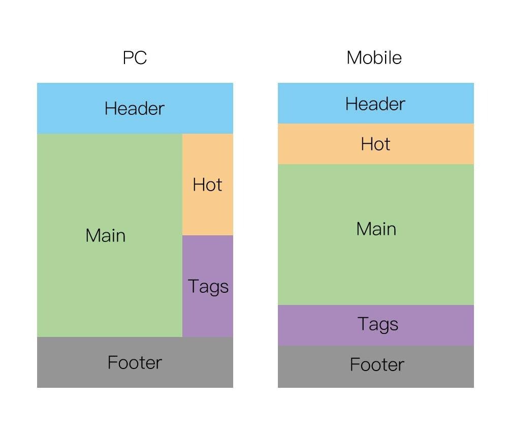
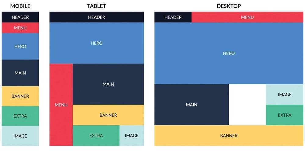
If there's one thing Grid excels at above all else, it's effortless responsive design.
Your audience is out there browsing your site on absolutely everything:
- Desktop computers
- Laptops
- Tablets
- Smartphones
- Large monitors
A truly responsive layout embraces these different screens and adapts itself seamlessly, saving you the headache of building separate mobile and desktop sites.
By pairing Grid's flexible sizing with a few smart media queries, you can guarantee your designs will look gorgeous and function perfectly, no matter what device your user is holding.
Combining CSS Grid with Flexbox
One of the most common questions beginners ask is, "Should I learn Grid or Flexbox?"
The wonderful answer is: you don't have to choose! You should absolutely use both, combining their strengths where they make the most sense.
Here is a workflow that professionals swear by:
Let CSS Grid handle the big picture the main, overall page layout.
Then, let Flexbox step in to handle the fine details, aligning content inside those individual components.
To paint a picture:
You use Grid to carve out space for your header, your sidebar, your main content, and your footer.
But when it comes to the navigation bar inside that header? Flexbox is perfect for laying out those menu links in a neat, horizontal line.
Using them together like this gives you the ultimate design superpower, all while keeping your stylesheets wonderfully tidy.
Practical Layouts You Can Build
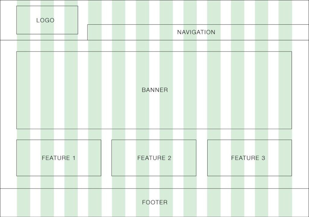
Once you've got the basics down, CSS Grid unlocks the door to a massive variety of exciting layout possibilities.
Blog Homepage
You can easily corral featured articles, category tags, busy sidebars, and recent posts into a layout that feels structured, inviting, and highly readable.
E-Commerce Store
Show off products in beautiful, fluid grids that elegantly rearrange themselves the moment the screen size changes.
Every polished product card can comfortably hold:
- Product image
- Product title
- Price
- Rating
- Add-to-cart button
- Admin Dashboard
Take overwhelming data statistics, massive charts, user lists, and dense reports and organize them into a surprisingly calm, usable interface that works beautifully on any device.
- Portfolio Website
Let your work shine in impeccably organized galleries where every single image and card aligns perfectly, giving your portfolio that sought-after premium feel.
Landing Pages
Confidently stack hero sections, feature highlights, glowing testimonials, and pricing tables without ever having to wrestle with annoying positioning hacks.
Performance Benefits of CSS Grid
Beyond just making your life as a developer easier and more enjoyable, CSS Grid actively helps you build websites that are leaner and more efficient.
Some of the hidden perks include:
- Reduced CSS complexity
- Better maintainability
- Improved readability
- Easier debugging
- Faster development workflow
While just using Grid won't magically make a slow website fast, writing cleaner, more logical code makes it infinitely easier to optimize and maintain your site in the long run.
Browser Compatibility
You might be wondering if it's safe to use. The great news is that CSS Grid enjoys incredible support across the web.
If you're using modern versions of:
- Google Chrome
- Microsoft Edge
- Mozilla Firefox
- Safari
- Opera
...you are completely good to go. They all fully support CSS Grid.
This means you can confidently roll out Grid in your live, production websites today without staying up at night worrying about browser compatibility bugs.
Best Practices for Using CSS Grid
If you want to code like the pros, keep these golden rules in mind:
Always grab a pen and sketch your layout out before you write a single line of CSS.
Strive for simplicity; keep your grid structure as clean and logical as possible.
Do your future self a favor and use clear, meaningful class names.
Remember that Grid and Flexbox are a team use them together where it makes sense.
Try not to nest grids inside grids inside grids unless absolutely necessary it gets confusing fast!
Constantly drag your browser window around to test your layout on different screen sizes.
Use Grid's `gap` property to ensure your spacing is perfectly consistent across the whole page.
Take pride in writing clean, well-documented CSS that you'll be proud to show others.
Building these good habits now will make your projects an absolute joy to maintain and expand as they grow over time.
Common Mistakes to Avoid
Hey, even seasoned veterans make mistakes with Grid every now and then!
Here are a few classic blunders you can easily avoid:
Making your grid structure way more complex than the design actually requires.
Designing a beautiful desktop layout but completely ignoring how it stacks on a phone.
Relying heavily on rigid pixel widths instead of leaning into the magic of flexible units like `fr`.
Assuming that because it looks great in Chrome, it automatically looks great everywhere else (always test!).
Forcing a complex Grid layout when a quick Flexbox setup would have done the job perfectly.
Moving content around visually with Grid, but accidentally messing up the logical reading order for screen readers.
The best way to steer clear of these mistakes? Build lots of small practice projects and always take a moment to review your code.
Career Opportunities After Learning CSS Grid
Make no mistake: mastering CSS Grid is an absolutely essential skill for any modern web developer.
Companies are actively looking for professionals who truly understand how to craft elegant, responsive layouts.
Having Grid under your belt opens doors to exciting roles like:
- Front-End Developer
- Full-Stack Developer
- UI Developer
- Web Designer
- WordPress Developer
- React Developer
- Angular Developer
- Vue.js Developer
- Freelance Web Developer
- Software Engineer
Whether you're hunting for your first internship, bidding on freelance gigs, or aiming for a senior position, showing off rock-solid layout skills will make your portfolio stand out from the crowd.
How to Practice CSS Grid Effectively
Reading guides like this one is a great start, but the real "aha!" moments happen when you get your hands dirty and start practicing.
Why not challenge yourself to build some fun, real-world projects like:
- Personal portfolio website
- Restaurant homepage
- Online shopping store
- News portal
- Company landing page
- Photography gallery
- Admin dashboard
- Blog homepage
- Educational platform
- Travel booking interface
With every layout you build, the concepts will click a little more, your confidence will soar, and before you know it, you'll be a CSS Grid master!
Mastering Css Grid Essential Resources
Ready to take the next step? Here are the most relevant and targeted resources specifically for Mastering Css Grid: